

今までレスポンシブの事を考えテーブルを使う場合はDLタグなどで対応していたのですが、colspanみたいな感じを表現する場合に面倒になり色々試し、とりあえず出来たのでメモします。
サンプル
PC版が上のキャプチャで、レスポンシブしたスマホ版が下のキャプチャです。
たまに空のセルもあるのでスマホ版にする場合は、display:none;で非表示にしています。
rowspanを使う場合は、もう一工夫が必要そうです。
▼ PC版
▼ スマホ版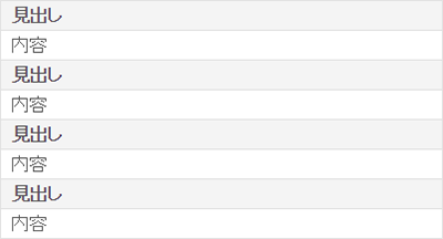
html
<table class="table_1">
	<tr>
    	<th>見出し</th>
        <td>内容</td>
    	<th>見出し</th>
        <td>内容</td>
    </tr>
	<tr>
    	<th>見出し</th>
        <td colspan="3">内容</td>
    </tr>
	<tr>
    	<th>見出し</th>
        <td>内容</td>
    	<th class="blank"></th>
        <td class="blank"></td>
    </tr>
</table>
CSS
/* table
**************************************************/
.table_1{ width:100%; border-collapse:collapse; }
.table_1 th, .table_1 td{ border:1px solid #e0e0e0; padding:10px; }
.table_1 th{ background-color:#f4f4f4; }

@media only screen and (max-width:600px){
	.table_1{ border-bottom:1px solid #e0e0e0; }
	.table_1 th, .table_1 td{ display:block; border-bottom:none; }
	.table_1 .blank{ display:none; }
}